Question Settings
The first thing you need to do after the installation of the plugin is to create a question for the filter. Go to the «WooCommerce Step Filter - Questions» page and click the «Add New» button.
Use the «Post content» as a description of the question. The «Title» setting will be used as the step's name. Alternatively, the title of the post will be used instead. This part is the same for any filter type and view.
First of all select one of «View types». Possible types are:
- Select - simple HTML element;
- Select with search - dropdown with a search input;
- Radio - simple HTML element;
- Checkbox - simple HTML element;
- Chips radio - inline radio view for many variants;
- Chips checkbox - inline checkbox view for many variants;
- Button radio - vertical radio view for a few variants;
- Button checkbox - vertical checkbox view for a few variants;
- Image radio - simple HTML element with an image within;
- Image checkbox - simple HTML element with an image within;
- Multi-choice checkbox - complex element to define OR/AND/NOT relation for each option;
- Multi-choice range - complex element to define OR/AND/NOT relation for each option;
- Number - precise numeric input with one handler;
- Number from - range input with one handler;
- Number to - range input with one handler;
- Number between - range input with two handlers;
- Formula - calculate a value by a formula.
After you can select a «Filter type» setting. You can see not all variants are allowed. This depends on the selected view type. Possible types are:
- Attribute - filter by a product attribute taxonomy;
- Price - just a price filter;
- Tag - filter by product tags;
- Brand - filter by product brands;
- Category - filter by product categories;
- Manual - manual selecting of products or categories;
- Meta - filter by meta key.
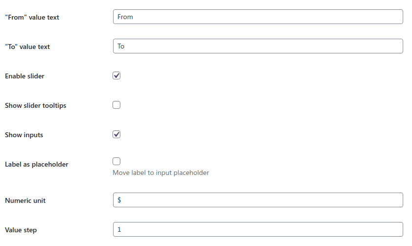
Numeric View Type
Numeric view types have their own settings bundle. This is possible to set «From» and «To» values caption, «Prefix» and «Suffix» text and change the step of the value. If you have decimal values as answers set this setting to the lowest possible fraction.
Also, this is possible to Enable/disable the slider for these types of views.
Checkbox/Radio/Select View Types
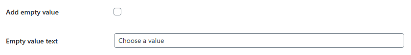
Select view type can have an «Empty value» to oblige the user to make a choice.
That's also possible to output the label nearby the input.
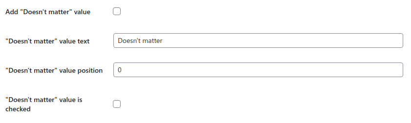
Types with the only answer ( radio / select) have the «Doesn't matter» settings group. It allows to output an answer which doesn't modify the query anyhow. Anyway, this type of views always requires a selected value.
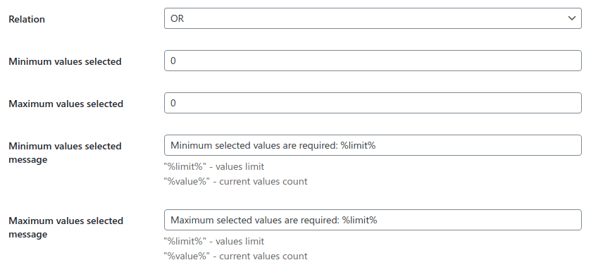
Checkbox-based view types have a «Relation» setting to define "OR" or "AND" relation between the selected answers. This also possible to define Minimum and Maximum values selected.
For radio / checkbox / select view types you can use the «Unmet values behavior» setting. It allows to handle question values which leads to zero-products result. Possible values are:
- Show values as usual;
- Show values as disabled;
- Hide values at all.

Terms-based View Types
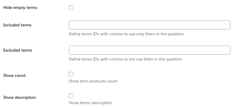
For radio / checkbox / select view types with attribute / tag / category filter types there is a possibility to
Include/exclude specific terms define them by IDs separated by a comma.
Here is how you can find them.
Alternatively, you can use a tiny plugin to see these IDs.
Also, for these view types there is a possibility to Hide empty terms, Show term products count, and Show term description near the value.
Not-numeric views with attribute / tag / category filter types have a possibility to Show count of products near the value name.
Multi-choice View Type
Multi-choice view types have their own settings bundle. This is possible to choose which of 4 possible values will be used for the question, set their order and change captions.
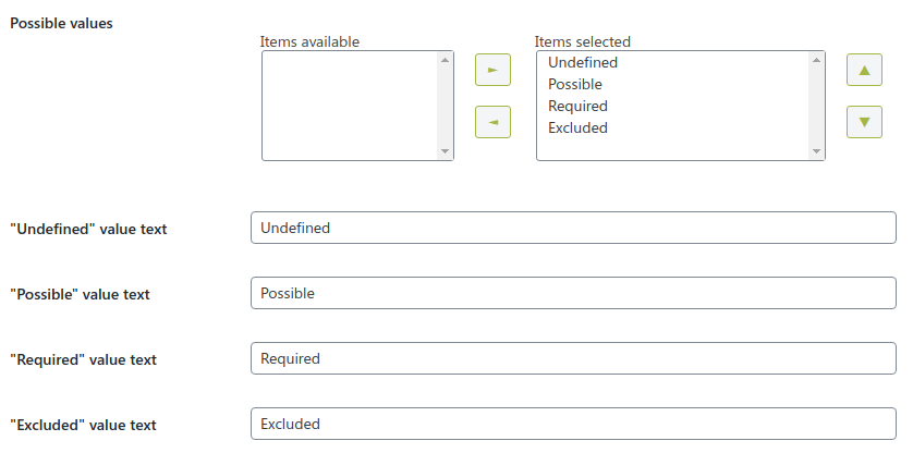
Image View Type
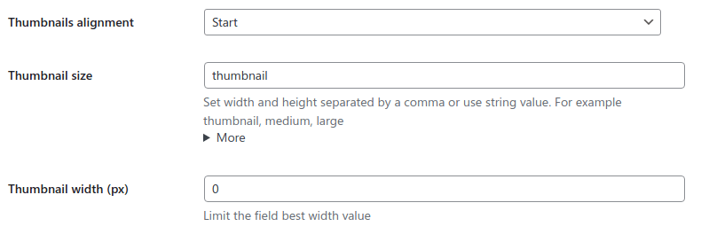
Image view types have the «Thumbnails alignment» setting to arrange them to start, end, center, and with different free space between the images.
You can set the «Thumbnail size» option. It might be one of the already registered sizes you can find by clicking the "More" setting, or a pair of integers separated by a comma, e.g. "50,50".
«Thumbnail width» setting allows to limit the max image size using a CSS unit.
Formula View Type
Formula view type provides filtering by a calculated value according to the formula string. That's a complex feature to filter products by numeric attribute / price / numeric meta.
This question type outputs no fields itself. You need to set the required input fields in the question description editor. To output a field use the
[wcsf-value-input name="%SOME NAME HERE%" value="%SOME VALUE HERE%"] shortcode.
The name attribute is required for saving the data. Checkbox/radio types require a value attribute also. All other required input attributes might be passed the same inline way.
Here are a couple of using examples:
-
<label>[wcsf-value-input type="number" name="My Numeric Field" value="1" min="1" max="24" class="form-control"]
 Numeric value </label>
-
<label>[wcsf-value-input type="checkbox" name="My Checkbox Field" value="Yes" class="form-check-input"]
 Checkbox Field </label>
-
<label>[wcsf-value-input type="radio" name="My Radio Field" value="Yes" class="form-check-input" checked="checked"]
 Yes </label>
<label>[wcsf-value-input type="radio" name="My Radio Field" value="No" class="form-check-input"]
 No </label>
Not all input types are supported
Unsupported field types are: "button", "image", "reset", "submit".
First of all, define default Formula variables and their values. There might be just static variables like x = 10. This is necessary because formula code works better with string variables than with pure number values.
Also, with the «Formula variables» setting you can define variables that might be not passed from the shortcode, namely the checkbox fields.
Much probably, you will have multi-word field names but the formula doesn't support them also. This way you need to define Formula name aliases as "My Custom Field => my_custom_field" and use the alias in the formula field.
Moreover, you might have string field values that should be transformed into a numeric value. That might be helpful for radio/checkbox types. For that you need to define Formula value aliases as
My Custom Field => Value One => 123
Before the execution of the formula, all of these settings will be used to find the appropriate variable value.
If there is a mistake in the formula you will see an exception on the results page.
The final thing necessary to configure is the «Formula operator» setting, which allows to compare the selected question source with the calculation result. This is possible to filter products which are:
- Equal to the calculated value;
- Not equal to the calculated value;
- Less than the calculated value;
- Less or equal to the calculated value;
- More than the calculated value;
- More or equal to the calculated value.
Also, this is possible to use the next built-in functions within the formula:
- sum - Calculate the sum of values;
- abs - Absolute value;
- min - Find the lowest value;
- max - Find the greatest value;
- sin - Find sin;
- cos - Find cos;
- tan - Find tan;
- atan - Find atan;
- round - Rounds a float.
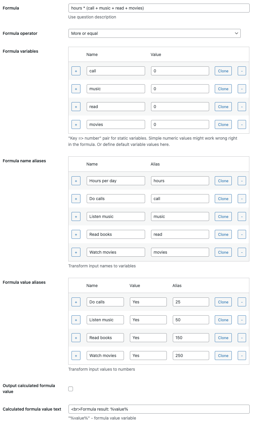
You can also output calculated formula value to be visible in the values list.
Action On Click
Basic views have the «Action on click» setting. It allows making action on selecting the value. This is possible to do:
- None - to do nothing;
- Submit - submit value and stay on the step;
- Submit and go next - submit value and go to the next step;
- Submit and go to results - submit value and go to the last step.

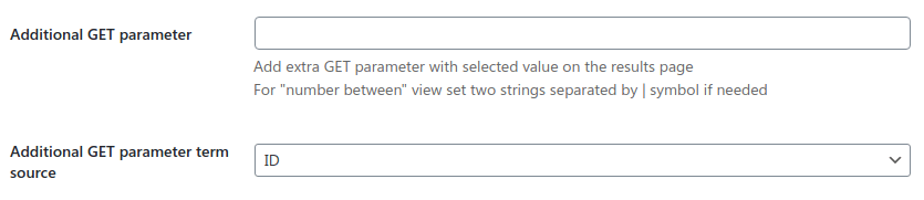
Additional GET Parameters
For not multi-choice view types you can add an Additional GET parameter. That's might be helpful if there is another filtering plugin on your site and you want to pass queried values from the Step Filter to it on the result page. For example, you can add a "category_id" additional parameter for the category filter type to have it as &category_id={requested_value} in the URL of the result page.
As the Number between view type has two result values you can define two keys separated by the "|" symbol.
For attribute / tag / category filter types also possible to change an Additional GET parameter term source to define what term property will be used as a value of the GET parameter. Currently, possible values are ID/Slug/Name.
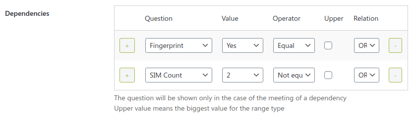
Dependency Rules
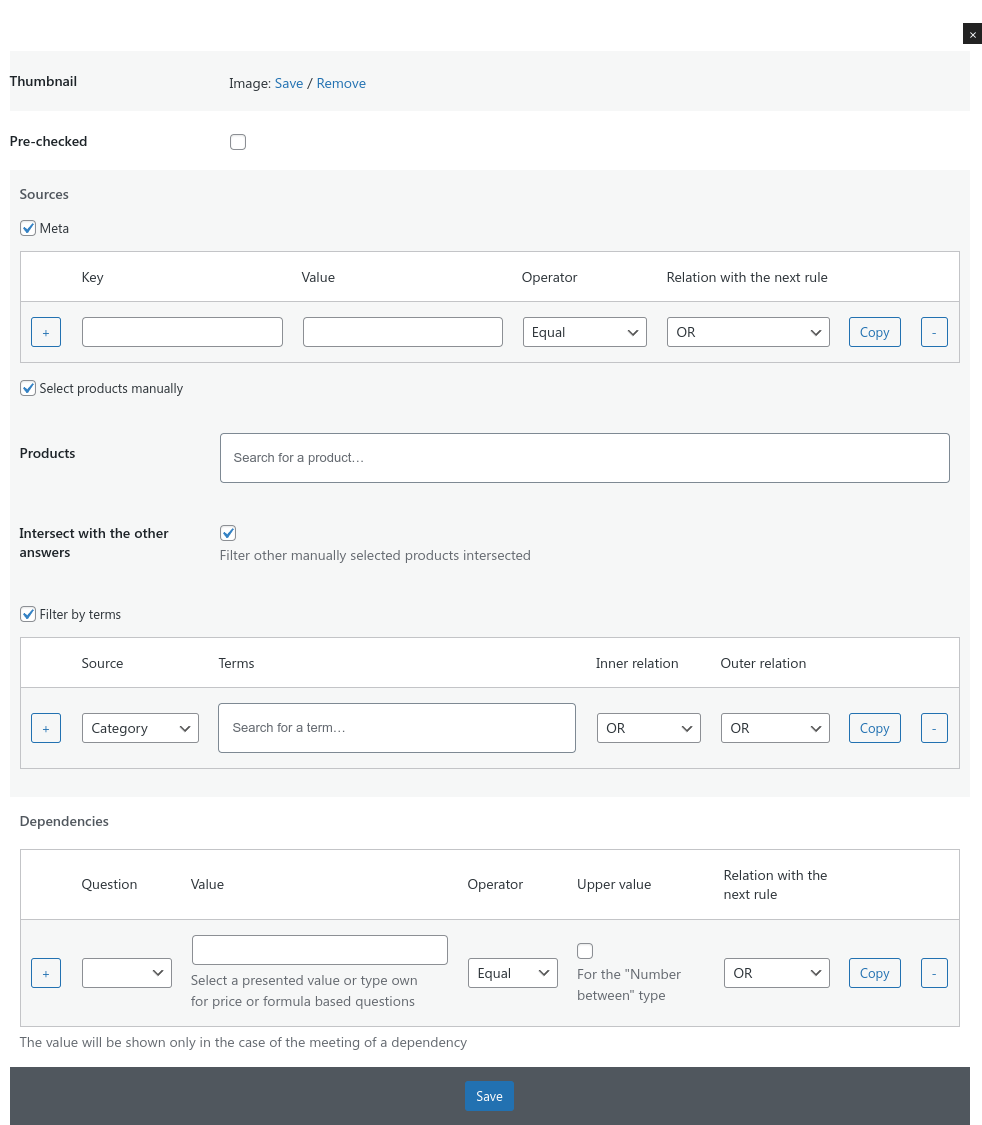
There is a possibility to make any question invisible in the filter until of firing of some dependency. Use the «Dependencies» settings table for this. Select another question in the dropdown, then select its value in the next field and the comparison operator. Then this question will be visible only then this dependency will be met.
If you need to make more complex dependency then add more dependency rows in the table and define relations between them.
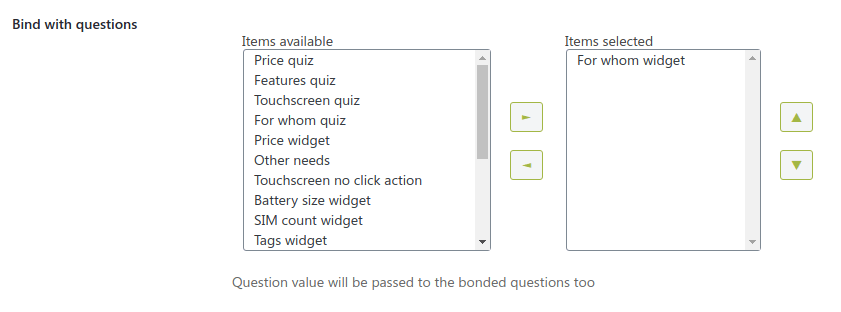
Question Binding
If you have a couple of different filters with different questions (for example, one in a page body and the second in a sidebar) you can pass the value from one question to another using the
«Bind with question» setting. To make this binding both directions set this setting for both bonded questions.
Skip Question
You can create any type question and use it in a filter but ignore it while filtering the results. The question might affect the dependencies and statistics but not the results.
Also, that's possible to have the question within the filter, but make it hidden. In case you want to affect the results somehow, but not show the question itself.

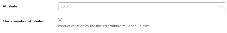
Attribute Filter
This is necessary to choose one product attribute as a source of the values.
Filtering with the Numeric view also allows to select what property to use as a filtering source - term name or term slug. Selected source should have only float values to work correctly.
You can force the question to Check variation attributes filter filtering. That means specific variation should exist while you filter by the attribute values.
All other settings depend on the selected view type.
Price Filter
Price filtering can have only a numeric view and have no extra-settings except the numeric's.
Min and max prices of the products will be used as a range.
Category Filter
With category type the question will have product categories as values.
You can define «Category parent» setting to get sub-categories by this category only.
«Category parent by a question answer» setting allows to select another category-based question to output only children of this question selected category. That could be helpful if you want to output top-level categories on one step and only children of the selected category on another step.
If you need to output only specific sub-categories levels or limit max categories tree depth use «Start from categories level» and «Max sub-categories level». But keep in mind the max sub-categories level setting can't be less than start from categories level setting
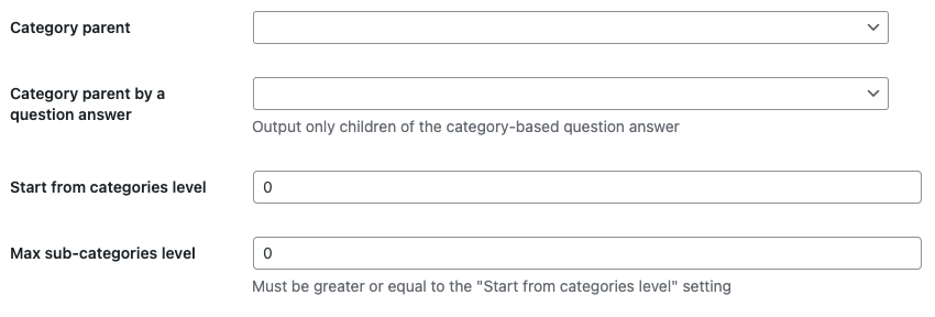
All other settings depend on the selected view type.
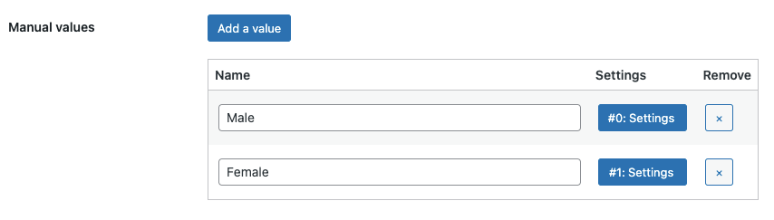
Manual Filter
Manual filter type allows to create and configure each possible value you need in the question.
Click on the «Add a value» button to add a row with settings.
Each value could have the settings:
- Name - a label of the value;
- Image - for image checkbox/radio view types;
- Pre-checked - setting to make the value checked by default;
- Source - set the value's source;
- Dependencies - define the rules of showing of the value.
In the value source modal you can select one of the values:
- Meta - filter products my meta keys;
- Product - choose specific products;
- Term - filter by different terms, as category, tag, or any attribute.
«Filtering by products» allows to intersect selected products between a few answers.
For example, answer 1 indicates: Product A, Product B, Product C; while answer 2 indicates: Product B, Product C, Product D. Having both answers selected there will be only Products B and C in the results while intersect option is on, and Products A, B, C and D while the option is off.
«Filtering by terms» allows to define flexible rules using OR/AND conditions. Namely, you can set the rule to output products from: Category A OR (Category B AND Tag A) OR Attribute A Value.
«Filtering by meta» also allows to define condition rules using OR/AND conditions and the operator, like equal, not equal, less, less or equal, more, more or equal.
Meta Filter
The «Meta key» setting is required for this type of filtering. Place a string to it and the question will collect all of the possible values of this meta key of products and then use them as the question's values.
For the numeric views the min and the max meta values will be used for the limits, but they should have numeric type.
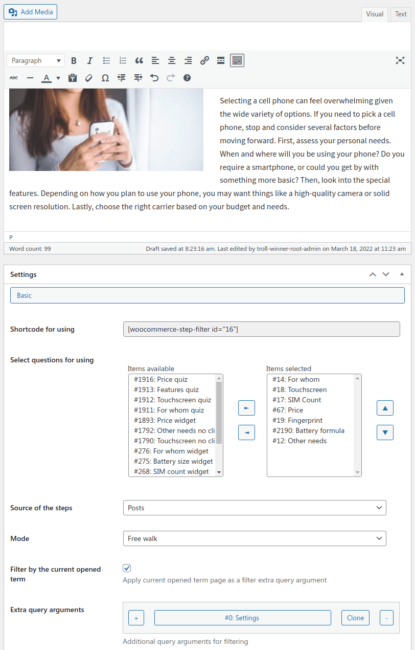
Filter Settings
Basic Settings
Firstly, select required questions or categories to be used as Steps of the filter.
Questions order
Then you're using question categories as steps their questions might be ordered not as you wanted to have them. To solve it easily use any 3rd-party plugin the posts sorting, for example,
Simple Custom Post Order.
Select created questions for using and change their order.
If the Filter by the current opened term setting is enabled the filter will apply this term as an extra query argument by-default. That might be helpful in case you output the filter as a widget. Opening different categories page will affect the filter basic query.
This is possible to add extra query arguments which will be used while filtering the results. You can include/exclude specific products, categories, or product attributes in the filtering results.
After tuning all settings, copy the shortcode into any page content to output the filter.
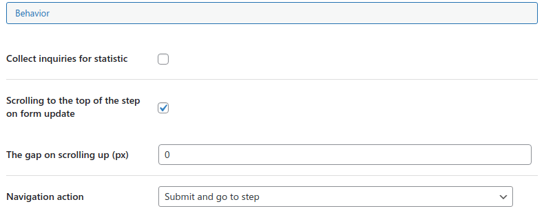
Behavior Settings
There are a few modes allowed:
- Free walk - allows to walk through the questions as user wants;
- Step by step - allows only to go consistently though questions;
- Single-step - show all questions one after one;
- Sequence - show questions one after one consistently.
Navigation items might have one of the Navigation action on click - just go to the next step or submit and go next.
Use the post content as a description of the first step. If you need this, check the
Enable description step setting. To change the step title, change the description ste title/subtitle settings.
«Save state to URL» setting makes possible to get a current filter state and active step via URL to share the selection via link. Works the same as the share button control.
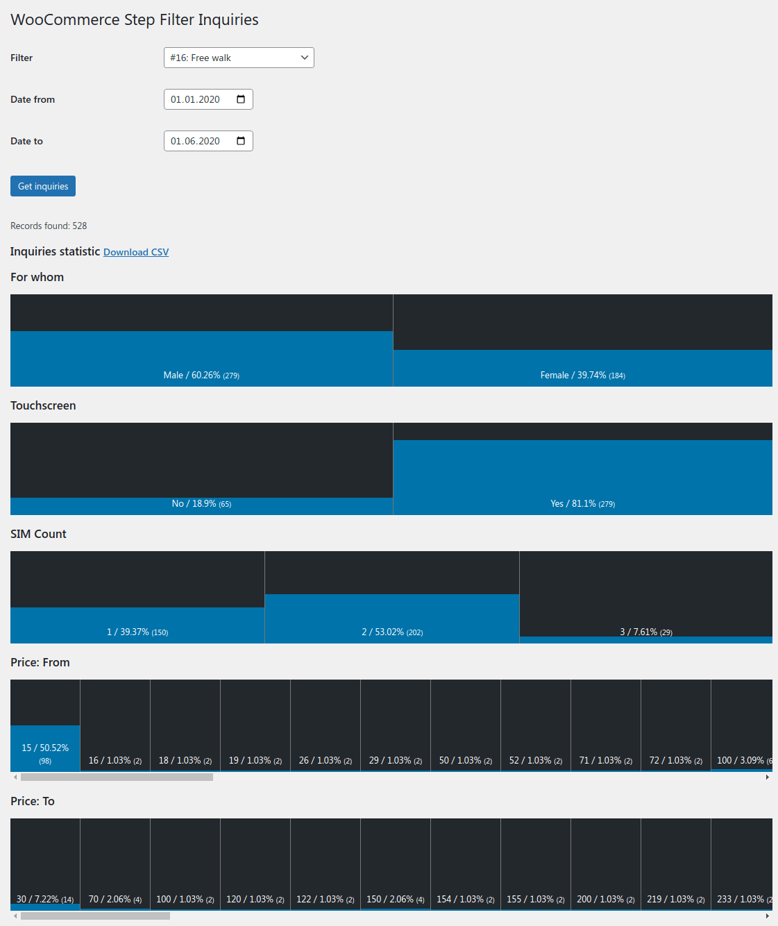
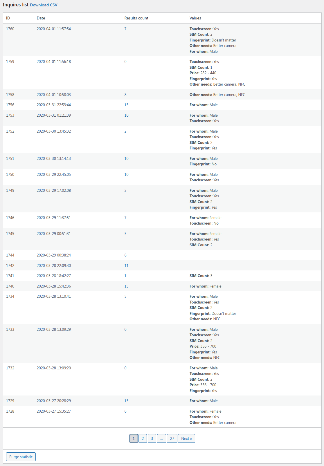
If you want to see the statistics of filter queries tick the Collect inquiries for statistic for this. You will see this statistic on a special plugin's page. This statistic doesn't collect any personal information.
This is possible to Scroll to top on the form update to let the user see the starting of the next question on submit. Also, there is the gap setting to not scroll the page too high.
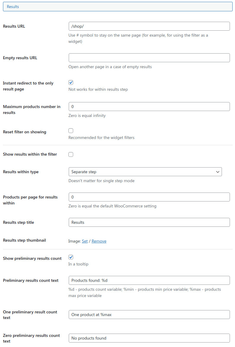
Results Settings
«Results URL» should have a URL to a shop or category page or just "#" symbol to stay on the same page (for using as a widget).
This is possible to set the Default results "order-by" value. Besides the native ordering values, the Best match value is available. It orders the products according the number of met answers.
«Empty results URL» setting will lead the user to a specific page if there are no filtering results by his request.
This is possible to make an Instant redirect to the only result page for the paged results showing.
Also, you can limit the Maximum products number results.
«Reset filter on showing» setting allows to keep the answers while going through the filter but reset them all while the page refresh.
This is possible to Show results within the filter on the last step without a redirect to another page.
«Showing results within the filter» have two modes:
- Separate step - adds a results step to the end of the workflow. This is possible to set this step Title and Thumbnail;
- Under steps - always output products lower the questions and filter them while answering the questions.
«Products per page» setting allows to define how many products will be shown on one results page.
Setting to output preliminary results shows a tooltip with number of pre-found products while selecting question answers.
There are settings to set a few/one/zero found products string. Using the special variables that's possible to output number of found products, and min/max found product prices.
View Settings
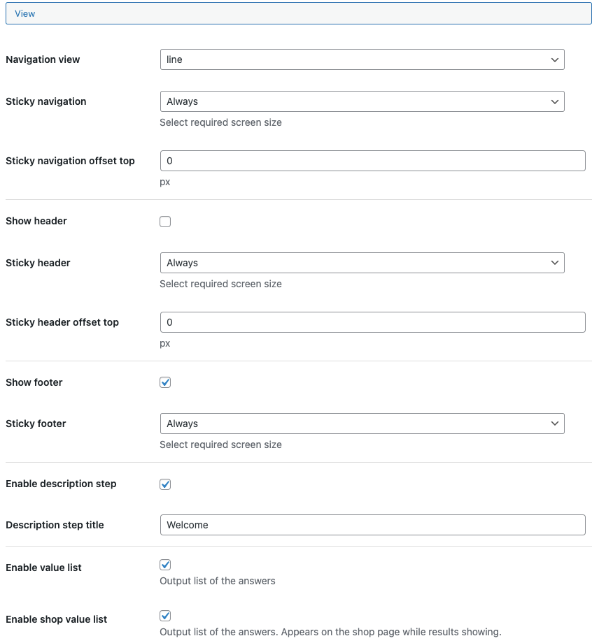
By the «Navigation template» option you can choose the style of the navigation tabs. Available values here: tabs, pills, buttons, line, line-horizontal, or none.
«Toggle navigation to mobile on screen size» setting allows to switch the selected navigation template to the mobile vertical button on a specific screen size.
Use the «Navigation button class» to change the mobile button view.
See the Button controls settings.
The «Sticky navigation» option controls if the navigation bar will be sticky on a specific screen size.
The «Sticky navigation offset» sets the gap between the sticky navigation bar for different screen sizes.
You can «Show/hide the header and footer» of the filter.
The «Sticky header» and «Sticky footer» options control if these elements will be sticky on a specific screen size.
The «Sticky header/footer offset top» tunes the gap between the top of the screen and the sticky element for different screen sizes.
You can enable/disable the value list showing within the filter or on the shop page.
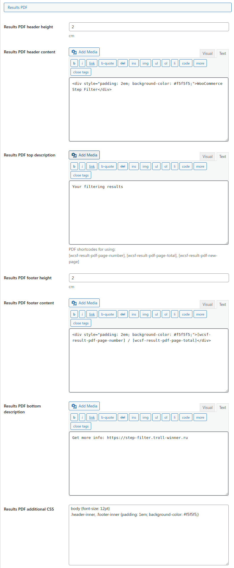
Results PDF Settings
PDF customization
To modify the PDF template make a copy of views/products/pdf.php to your active theme (or child theme) directory to woocommerce-step-filter/products/pdf.php
Check the «Templates Customization» section for more info.
You can change the Products number and Columns number of PDF.
«PDF spaces» setting allows to define page all sides spaces. Be sure top/bottom spaces are enough to fit header/footer into.
«PDF header content» will be used as the header for each page. Its color and inner padding might be configured right there using CSS. This is possible to use special shortcodes to output the current page number and total pages number.
«PDF top description» content will be placed before the results loop.
«PDF footer content» will be used as the footer for each page. Its color and inner padding might be configured right there using CSS. This is possible to use special shortcodes to output the current page number and total pages number.
«PDF bottom description» content will be placed after the results loop.
«PDF additional CSS» setting provides a possibility to pass extra CSS rules into the PDF file.
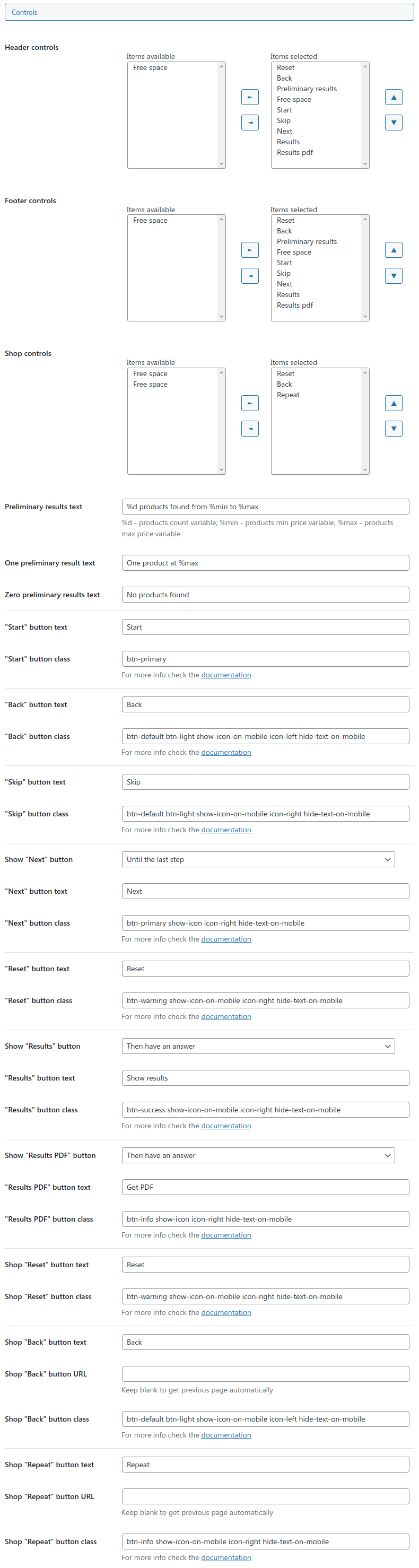
Controls Settings
The Control buttons General setting defines several options on the Navigation Control buttons.
You can choose specific controls for header/footer and define their order. There are also "free space" elements available to justify controls left, center, or right specific way.
The main feature of these Control buttons is they may have different classes for their styling and behavior. As the main stylesheet of this plugin is based on the Bootstrap 5 framework you can use any of the
available styling classes for Buttons and
display utility classes.
Also, there are a few classes that control the buttons' text and icons' appearance:
- hide-text - hides text of the button but keeps it for screen readers;
- hide-text-on-mobile - hides text of the button on small screens but keeps it for screen readers;
- icon-start - define on which side of the button the icon should appear;
- icon-end - define on which side of the button the icon should appear;
- show-icon - always shows a pre-defined button icon. Requires icon-left/right class for work;
- show-icon-on-mobile - shows a pre-defined button icon on small screens. Requires icon-left/right class for work;
Plugin Settings
Main Settings
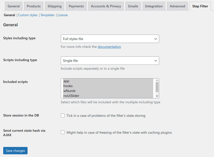
You can choose what styles should be included from the plugin.
- «Full» is the self-sufficient style file. It applied all required styles to the plugin's elements.
- «Basic» styles are fine for you if your active theme is based on the "Bootstrap 3/4/5" framework. In this case, this filter's style will be inherited from your active theme's. Despite this, you can also add your own CSS-styling rules.
- «None» value doesn't include any styles at all. In this case you can create a full custom CSS-style from the plugin sources and tools or by your own approach for styling.
- «Custom styles include the file with your custom styles such as colors, font-size, and so on. To modify it go to the «Custom styles»» sub-page.
The plugin is made using the newest ES6 modules scripts, so there is a setting to select «Scripts including type» - that could be a raw JS sources or build JS bundle.
Sometimes server's configuration might have problems with storing sessions. For example, if the filter can't go next thought the steps or loses the answers on the page update. In this case tick
«Store session in the DB» setting which works much reliable but probably a little bit slower.
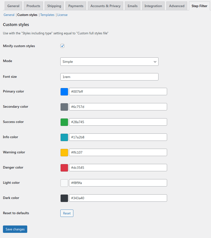
Custom Styles
It is possible to reconfigure the plugin's styles according to your needs.
Don't forget to choose a «Custom full styles file» value of the «Styles including type» setting.
This is possible to «Minify custom styles» using the special setting. That might be helpful for the debug needs. In other cases keep this setting enabled to keep the CSS-file smaller and save your customers' traffic.
There are two modes for custom styling. The «Simple mode»
provides only a few main variables to change.
Sometimes the filter's fonts look very small on specific themes. To resolve this Adjust the «Font size» option. You can use any CSS units there, like "rem", "px", "pc", and so on. Apart from that, you can also change the product title and price font sizes.
You can also change the colors for different colorful elements of the filter, like controls, buttons, and navigation.
The «Advanced mode» allows you to change a great range of variables, but it requires SCSS knowledge.
All the variables of the plugin are available to be changed by using a text editor.
Advanced mode also supports using of a pre-defined Bootswatch themes, included to the plugin. Select a theme and click the «Apply» button once to use the theme for the filter, but keep in mind the «Custom SCSS» setting will be override by the default values with the applied theme styles. You can modify custom SCSS setting after applying a theme.
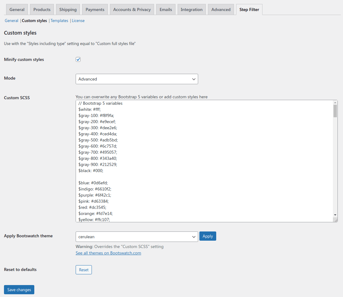
In a case of a styling-command error, you will see a message while saving. The styling file will not be saved.
In case you need to reset your styles to their initial state click the «Reset to default» button once.
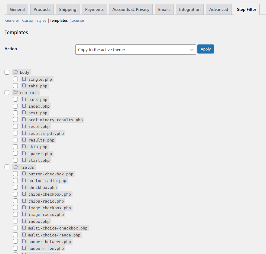
Templates Customization
WooCommerce Step Filter plugin has a folder of views that are used to be shown on the front of the site. There is a possibility to customize them as you need and keep the changes while the plugin updates.
To do this select files that require customization in the views list and apply the «Copy to the active theme» action in the form above. Selected views will be copied into your active theme in the
woocommerce-step-filter
folder saving the sub-folders structure. Files copied to your active theme will be marked by a tick icon.
The plugin firstly searches for a specific view in the theme's folders, and if it doesn't find the view there, it gets the view from its own directory.
You can edit the copied views using the «Appearance - Them editor»
page.
If you want to delete some views from your active theme choose them in the views list, select the appropriate point in the form dropdown above and apply the changes. The view will be removed from the theme and the plugin's view will be used instead.
Keep in mind plugin might have some changes in the view files while updating. So if you have customized ones some of the new features will not work or might work wrong with them. This way just copy them from the plugin and adjust to your needs once again.